|
|
#1 |
|
Registered Member
Join Date: Feb 2005
Location: Belton, Tx
Posts: 28
|
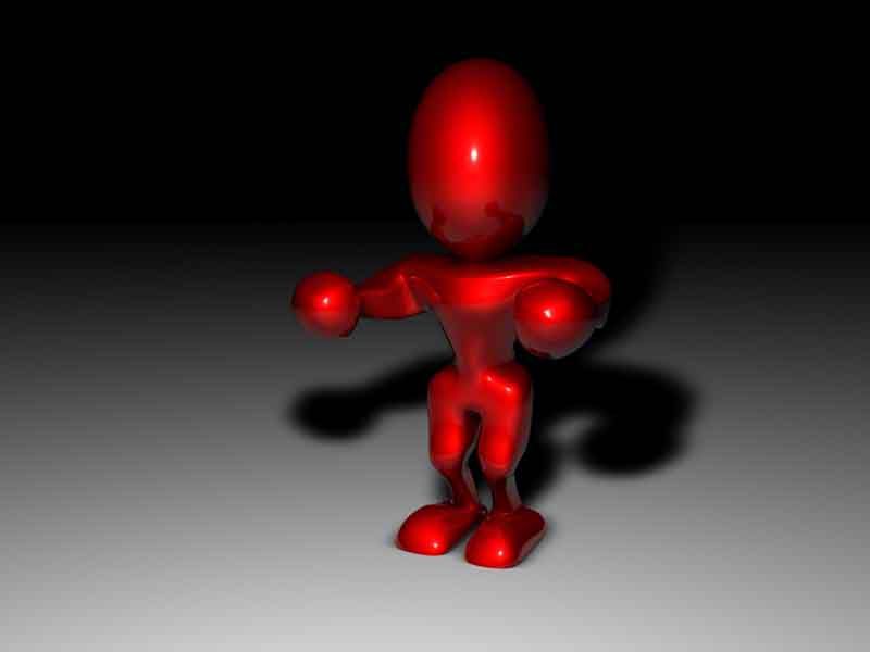
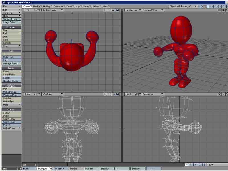
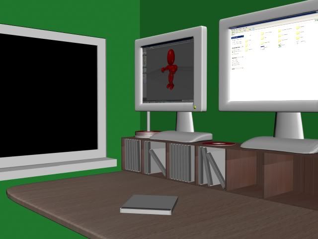
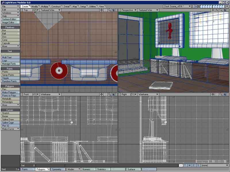
This is my first post, but i thought i'd start off by showing you one of my WIP, we're supposed model and animate our character for around 30 secs to 2 minutes. i'm trying to model a desk scene, and my character is a simple character i modeled, and he's supposed to jump out of the computer screen and onto a keyboard i need to model still, i'm not to familiar with texturing, but i'm wanting a realistic look to my desk, so any texturing tips will be greatly appreciated
    
__________________
AIM - fadedb8ta Yahoo - fadedb8ta "Let's raise our Glasses to symmetry" |
|
|

|
|
|
#2 |
|
Registered Member
Join Date: Apr 2004
Location: Scotland
Posts: 604
|
Hi, its looking good, im sure ive seen a similar scene to the desktop u have modeled in the Gallery part of this site. u should try and copy that for textures and stuff. until u get used to the surface editor.
just out of interest, are u studying at Paisley University ? |
|
|

|
|
|
#3 |
|
Registered Member
Join Date: Feb 2005
Location: Belton, Tx
Posts: 28
|
TY, heh, and yeah in the gallery, thats where i got the idea for the desk scene bc that one is so good, i'm trying to replicate it, but just can't quite get image maps to look as good as i'd want, i use the www.sxc.hu for HI res images, and i'm also lacking in the lighting dept.
 and i'm studying at the university of mary hardin-baylor in texas. I assume there are alot of people here from Paisley University? and i'm studying at the university of mary hardin-baylor in texas. I assume there are alot of people here from Paisley University?
__________________
AIM - fadedb8ta Yahoo - fadedb8ta "Let's raise our Glasses to symmetry" |
|
|

|
|
|
#4 |
|
Registered Member
Join Date: Feb 2005
Location: Belton, Tx
Posts: 28
|
Here is a minor update with just a little better lighting. i still have lots of modeling to go.
__________________
AIM - fadedb8ta Yahoo - fadedb8ta "Let's raise our Glasses to symmetry" |
|
|

|
|
|
#5 |
|
Registered Member
Join Date: Apr 2004
Location: Scotland
Posts: 604
|
if this is Lightwave u are using, make sure u have ambient lighting down at 2% max, i preffer not to use it atol, but u will notice a big difference straight away, beacuse it will get rid of that look as if its beeing lit from all angles
|
|
|

|
|
|
#6 |
|
Registered Member
Join Date: Feb 2005
Location: Belton, Tx
Posts: 28
|
Thanks, yeah i'm using LW8, and the lighting tip helped with the shadows, its much better this way, any tips on what to put outside the window?
__________________
AIM - fadedb8ta Yahoo - fadedb8ta "Let's raise our Glasses to symmetry" |
|
|

|
|
|
#7 |
|
Registered Member
Join Date: Apr 2004
Location: Scotland
Posts: 604
|
1st, get rid of the green wall
 for out side i would use a high rez image of a scene from ur window or from a University window or somthin then put it on a curved surface out side the glass, and just use the standard preset glass, for the window, then just tweek the brighness of it, its really hard to create a realistic window scene if u are very new to 3D, because all the light is coming from the 1 place ie the window. u usually see in begginners work, shadows being cast in thw wrong direction and stuff. look into HDRI lighting aswell, this will help with the reflections and stuff. Best thing to do is find a good tut on room lighting, and learn basics 
|
|
|

|
|
|
#8 |
|
Full Access Member
Join Date: Mar 2004
Location: Scotland
Posts: 119
|
hi man looks pretty sweet, thing is the wall, ok it does need a change in colour, for some reason I always go for dark blues.
Heres an idea for you, dont use any photogenic images for the window it will take away any cohesion with your style, does work sometimes but best to not. try making it a real window, then put another wall out side the one you have and put a photoshop sky in that you have made, like blue background and use the spray paint to make soft clouds. Keep it all running together and you`ll do fine man. Oh, and I am another from Paisley Uni, theres a few lol. Looks good, wish you could post your animation some where, anyways keep up the progress. :p |
|
|

|
|
|
#9 |
|
Registered Member
Join Date: Feb 2005
Location: Belton, Tx
Posts: 28
|
It's beginning to look better by the day!
__________________
AIM - fadedb8ta Yahoo - fadedb8ta "Let's raise our Glasses to symmetry" |
|
|

|
|
|
#10 |
|
Registered Member
Join Date: Feb 2005
Location: Belton, Tx
Posts: 28
|
It's beginning to look better by the day!
__________________
AIM - fadedb8ta Yahoo - fadedb8ta "Let's raise our Glasses to symmetry" |
|
|

|
|
|
#11 |
|
Full Access Member
Join Date: Mar 2004
Location: Scotland
Posts: 119
|
This is looking good, only thing I would try is change the light into an area light and see if it smooths those sharp edged shadows.
It has improved a great deal nice work m8. |
|
|

|
|
|
#12 |
|
Registered Member
Join Date: Feb 2005
Location: Belton, Tx
Posts: 28
|
Thanks
 I'll try an area light right now! I'll try an area light right now!
__________________
AIM - fadedb8ta Yahoo - fadedb8ta "Let's raise our Glasses to symmetry" |
|
|

|
|
|
#13 |
|
Registered Member
Join Date: Feb 2005
Location: Belton, Tx
Posts: 28
|
wow, this looks alot better, unfortunately since i'm planning on animating this scene, i wont be able to use the area light, due to ungodly render times
 But now i know that area lights help for soft shadows But now i know that area lights help for soft shadows 
__________________
AIM - fadedb8ta Yahoo - fadedb8ta "Let's raise our Glasses to symmetry" |
|
|

|
|
|
#14 |
|
Registered Member
Join Date: Feb 2005
Location: Belton, Tx
Posts: 28
|
Sorry, heres the pic i forgot to attach.
__________________
AIM - fadedb8ta Yahoo - fadedb8ta "Let's raise our Glasses to symmetry" |
|
|

|
|
|
#15 |
|
Registered Member
Join Date: Sep 2004
Location: Scotland
Posts: 294
|
Hey man, looking really good so far, whats your wee dude going to do when he jumps out the screen?
On the lighting issue, you could try making your outside light a wide spotlight and use shadow maps instead of ray tracing to get a soft edge or just crank up antialiasing with adaptive sampling set (to keep the renders quick) also, im not sure the kind of lighting conditions you're going for, but i would tend to have a dim point light in your room with shadows turned off just so you can see into the shadows fractionally... like i said, it depends on the look you're going for though. Hope it all goes wel for you? whens the due date? ours is May 6th 
|
|
|

|
 |
 Similar Threads
|
||||
| Thread | Thread Starter | Forum | Replies | Last Post |
| Animation Project: Beasties Ltd. | KrisYoung1980 | W.I.P | 120 | 25-05-2006 04:29 PM |
| Animation Project: Living Prey | Peter Murphy | W.I.P | 22 | 10-03-2006 01:43 AM |
| Character for University Animation | davie563 | W.I.P | 123 | 22-05-2005 05:13 PM |
| new project | RoD | W.I.P | 0 | 04-05-2005 08:39 AM |
| 3d web magazine (university project) | puppet | Members Lounge | 2 | 10-11-2004 09:48 AM |
|